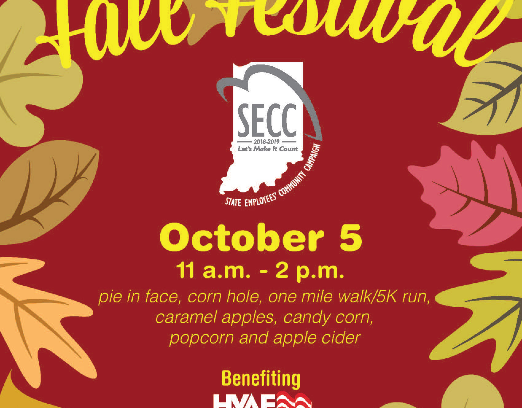
Along with every quarterly newsletter, the Kokomo-Howard Public Library always created posters to advertise for specific events for the public. Because the library had so many events for the public, it was important that each one have a distinct personality.
Here I wanted to create something that evoked a sense of old Hollywood through type setting and merge it more modern sense of design. The illustration of James Dean was created from a photo of him and tweaked by me. The color scheme was meant to be a more muted version of the Indiana colors. The hope was that this would tie the design together by evoking a "classic" style.


