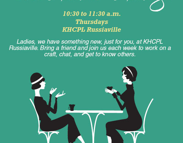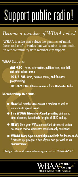
These simple flyers were used to promote funding for the station at events. Color's were pulled from Purdue University's branding. The font choices were meant as a call back to the station's founding. At that time the station was ramping up for a major fundraising campaign for the station's 90th anniversary so it was meant to tie in with the planned branding for that.