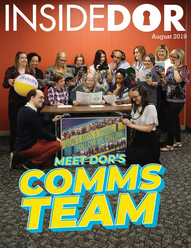
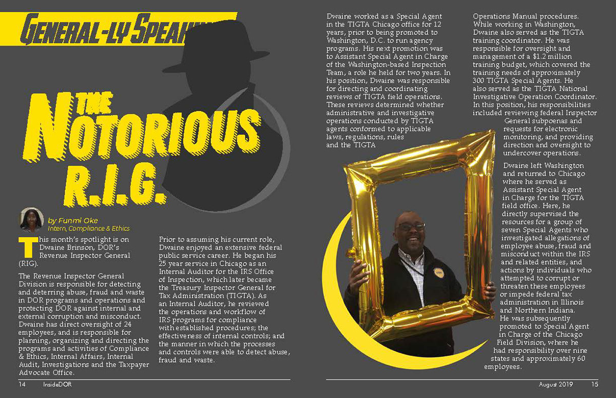


Early on in the process of developing this issue, we knew that we would want to turn the cover into a poster for display in the office. The cover photo was staged to show each of us at work at our job. The type treatment was meant to be simple but eye-catching so that it could be used for branding on future articles and posters that focused on specific teams.
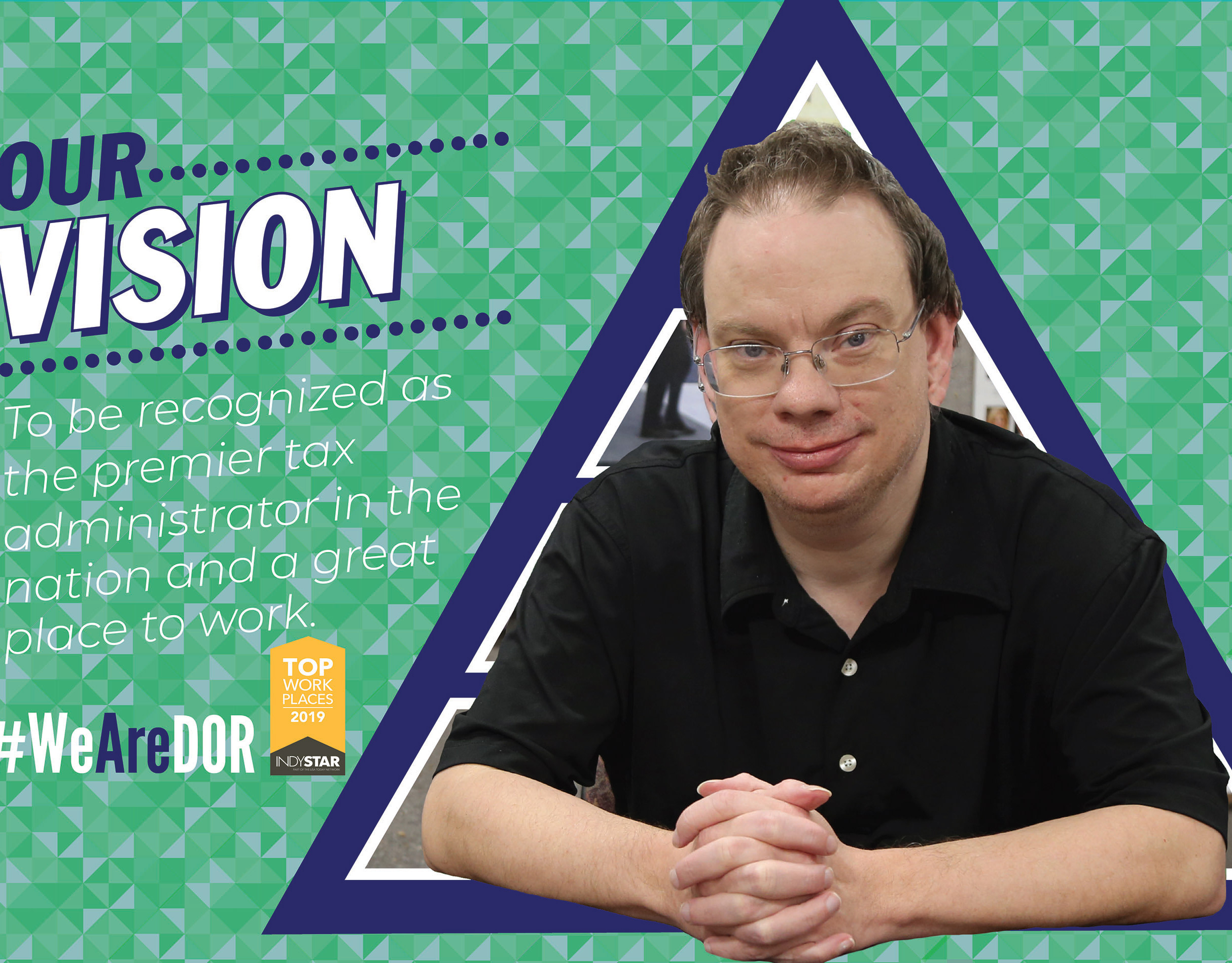
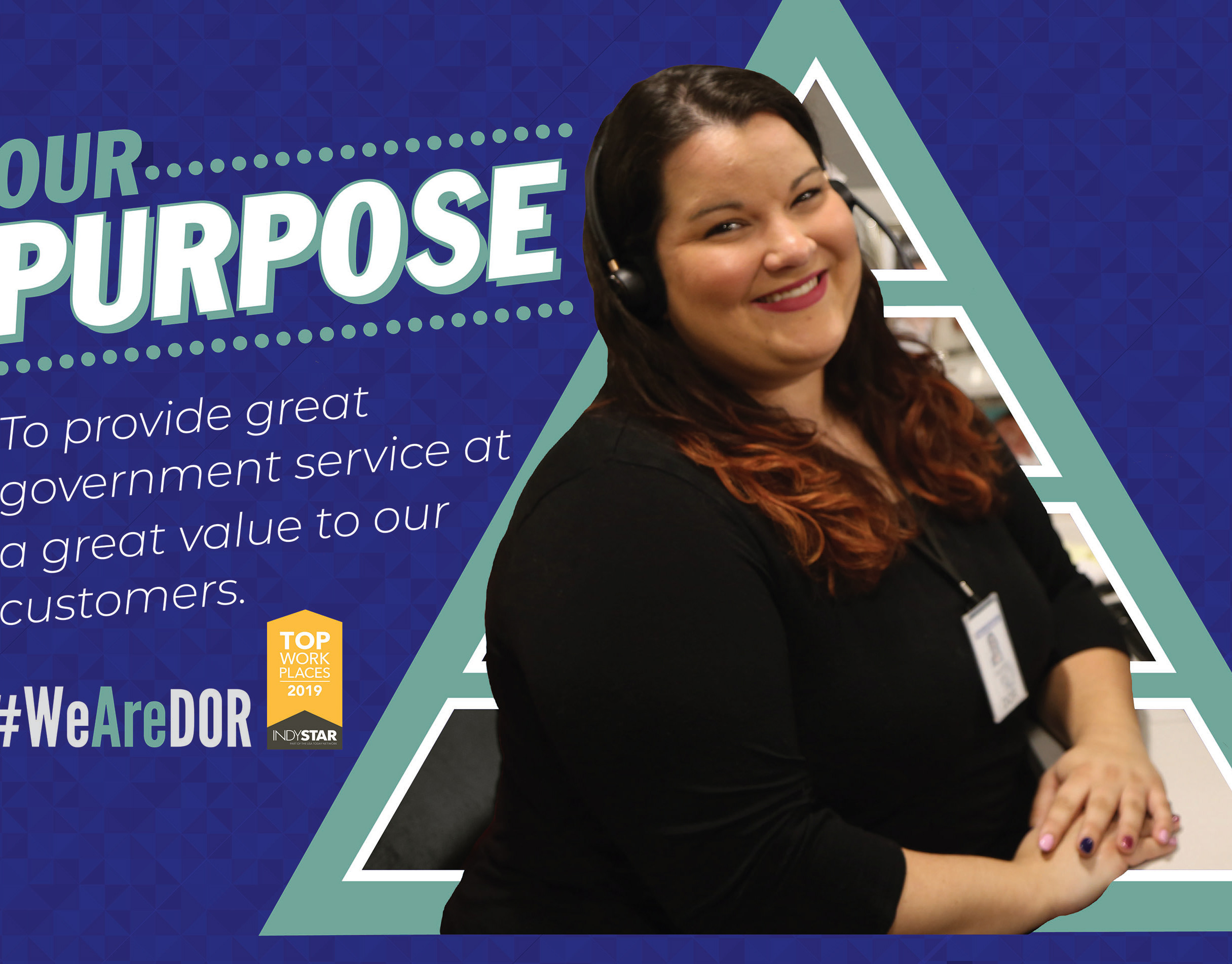
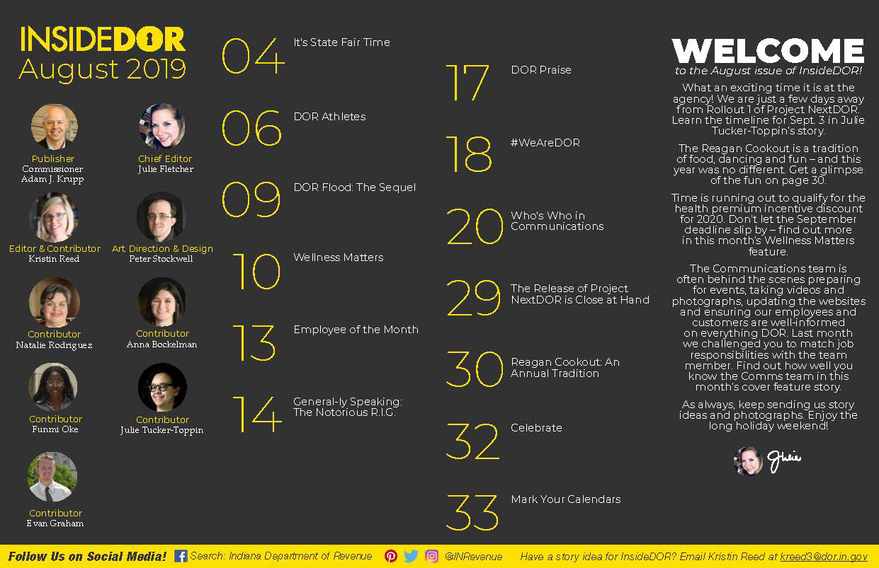
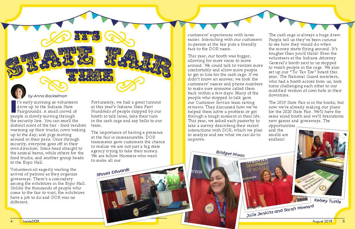
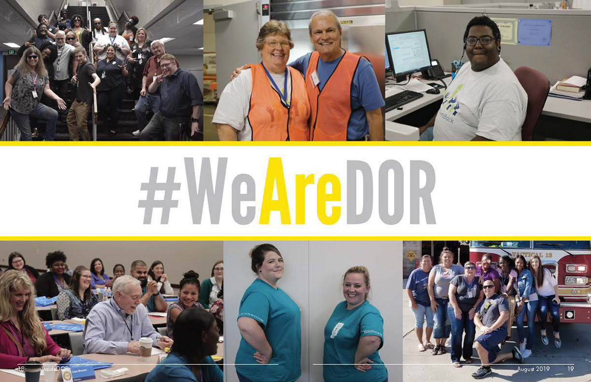
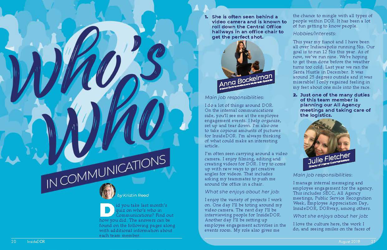
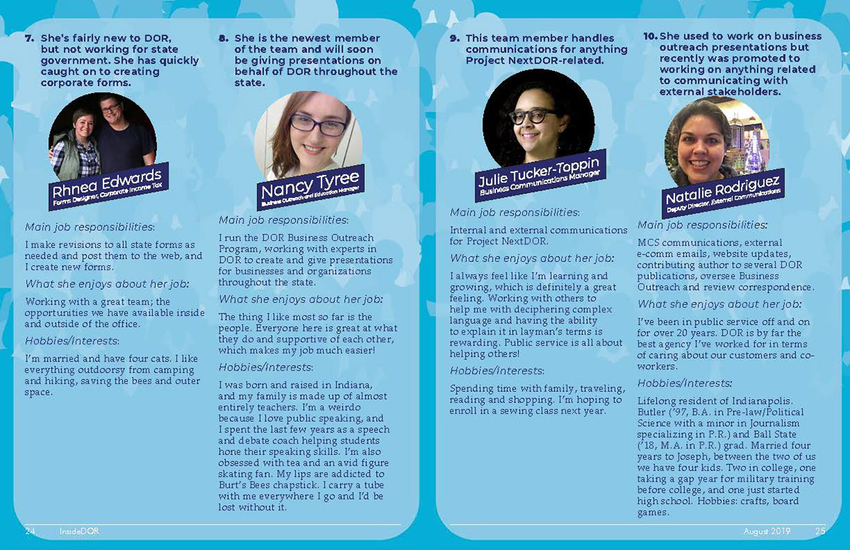
The focus of each of these issues was always to feature people from across the agency and their efforts to serve the state of Indiana. As such the designs of each article are meant to communicate fun and community. The variety of colors, layouts, and type treatments are meant to reflect this.